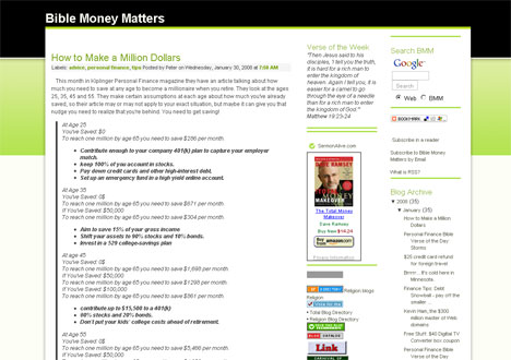
Bible Money Matters has been live on the web since January of 2008, and in that time the site has gone through 3 different designs, not all of them that great. I think the site is now to a pretty decent place that I’m happy with. But let’s take a look back at some of the old designs.
Quick Navigation
The Old Designs
The first look that I tried was when the site was hosted on blogspot. The theme was a free one that I found on one of the “free blogspot theme” websites. It wasn’t really all that great, but the design was functional, and at the time all I really knew was that I wanted to have a theme that was green and black. It was indeed green and black:
After about 5 months of blogging I knew that I was going to continue the blog for more than just a few months, so I invested in a domain name and switched the site to be a self hosted wordpress installation.
Once I moved I immediately put up the new theme, one designed by Brian Gardner called Vertigo. Brian Gardner does some great themes (and I stilll recommend them), and I customized the theme to my own liking.
The Vertigo theme is the design that most of you are probably familiar with as we have been using it since July of last year.
In the past few weeks I’ve been thinking about changing the site design because although I liked the Vertigo theme, it was starting to lack some of the compatibility and back end functionality that I really needed it to have. The theme was limiting what I could do with this site. Time to upgrade to something newer, better and better in just about every way.
The New Design Using Thesis WordPress Framework
I have another website called Logos For Websites where I design logos for other people’s blogs, websites, twitter pages and more. Through that site I was beginning to hear more and more about the Thesis WordPress theme that is becoming so popular. The theme, designed by Chris Pearson, is a highly customizable WordPress framework that you can use to give your site a nice clean look right out of the box, or customize as much as you’d like using the back end tools, CSS and other more advanced techniques.
After hearing more and more about the theme, especially from Thesis experts like Larry at Empty Cabin Media, I decided to take the plunge and buy my own developer’s edition of the theme. I wanted to use the theme on Bible Money Matters and Smart On Money in addition to my fitness site, Quick To Fit.
After putting together my own customized edition of the Thesis Theme over the past couple of weeks, I launched the new improved Bible Money Matters (version 3.0) yesterday.
I’d be extremely grateful if you could all check out the new theme, poke around, and let me know what you think! If you find any problems, or things that are issues for you, please leave me a comment on this post or send me an email through the contact link at the top.
Why I Bought The Thesis WordPress Theme
There are a lot of reasons why I’ve decided to jump onto the Thesis Theme bandwagon. I thought I would give a little mini review of the theme and talk about why I chose it for my site.
- Ease Of Use:
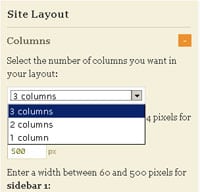
While getting into the nitty gritty of customizing the look of the theme may take some extra knowledge of CSS and php, getting the theme up and running, changing layouts, colors and customizing the site’s framework are all made easy through the Thesis Theme’s back end. The “Thesis Options” and “Design Options” screens allow you to change pretty much anything you could imagine. Say you want only a content column and one sidebar? Just choose that 2 column option in the Thesis Design options. Want to change your sidebar from the left to the right side? Again, as easy as choosing that choice in the options panel. Maybe you want to choose a new font for your site? Choose the new font in the Design options screen, and you can even have different fonts for headlines, body content and bylines. Customize it as little or as much as you want!
- Customizability:
The theme looks nice right out of the box, but you can customize it as much as you want. Customizing the theme is made easier through the theme’s custom.css and custom_functions.php files. The custom files allow you to add all your custom CSS and PHP directly to your custom files in a separate directory, keeping your custom design safe when upgrading the theme. No need to go tinkering and updating in your theme files every time you upgrade, what a relief! Plus there are only two files you ever need to update! Talk about keeping it simple!
- SEO Advantages: Thesis has a ton of SEO advantages built right into the theme and it’s options. Things like Canonical URLs support, custom title tags, meta descriptions and custom meta keywords are just the start.
- Support And Community: The Thesis community and the support forums are second to none. While there are a ton of good themes out there, I don’t think any of them have a support community as awesome as the Thesis Theme does. If you’re ever looking to customize your theme and have questions about how to do it, just go onto the support forums and do a search. Nine times out of ten the question has already been answered there. If not, do a google search and there will be tens of tutorials and reviews talking about your question. It really is amazing how much support there is out there.
Those are a few of the main reasons that I decided to start using Thesis, but now that I’m using the theme I’m enjoying it even more. I keep finding new little things to like about the theme, and can’t wait to get more into customizing the options. I’m discovering new things every day that I didn’t even realize were there!
If you’re looking for a new theme for your blog, I’d highly recommend checking out the Thesis WordPress Theme. The theme does cost $87 to use on a single site, or $164 for the developer’s option to use it on as many sites as you’d like, so it isn’t cheap. I think you’ll find that it is completely worth it because of it’s ease of use, customizability, SEO advantages and it’s stellar support community.
Buy Thesis WordPress Theme Here
What Do You Think?
So now that I’ve gone live with the new look, I’m looking for your feedback.
What do you think of the new design, and what do you think of Thesis WordPress framework?


 The theme looks nice right out of the box, but you can customize it as much as you want. Customizing the theme is made easier through the theme’s custom.css and custom_functions.php files. The custom files allow you to add all your custom CSS and PHP directly to your custom files in a separate directory, keeping your custom design safe when upgrading the theme. No need to go tinkering and updating in your theme files every time you upgrade, what a relief! Plus there are only two files you ever need to update! Talk about keeping it simple!


I love the new site design! Overall I would have to say the new header is the best part. I also love the way it fades out on the sides to black.
Keep up the good work!
First, I love Thesis. I am using it over at Top Blog Posts and plan to redo The Happy Rock too which needs a major overhaul.
As for my comments, I liked the old theme style better, mainly the header. The liked the 3D full width toolbar and the full white background.
There is a lot more going on now up there with different sized text and navigation above and below and on the right end of the banner that makes it seem jumbled and hard to quickly scan and find stuff. The old one was also more brandable and recognizable.
Haven’t noticed any errors, but I did noticed that you went with the taller adsense which seems to waste some space and add more clutter while pushing the content even further down the page. The revenue test will be interesting on that one.
Just one man’s opinion, nto trying to be critical for critical sake, hope it helps Pete! You know I wish you nothing but the best.
The funny part is that it is so much easier to be objective and critical on other’s work rather than your own. I am sure you and others can find similar stuff you don’t like with Top Blog Posts. But to me it looks pretty good. After you spend so much time crafting I personally lose objectivity.
Thanks for the feedback, I appreciate it!
Actually the adsense on the post pages is exactly the same as on the previous theme, the 336×280 size unit. The content is actually about the same on the page, or slightly higher than the last theme.. I know the screenshot above shows a 468×60 unit, but that was on the homepage, and that unit has now been removed completely. So this theme actually has less adsense on it.
In regards to the header/navigation, I’ll take that into account. I’m still tinkering with all that, so it may change a bit depending on all the feedback i get!
Peter – Looks good – nice implementation of Thesis.
It’s getting lonely out here for non-Thesis bloggers!
thanks! I really like the theme you’re using as well though – it was one of my favorites, and probably one of the ones I might have used if I hadn’t bought thesis!
I am also a non-thesis blogger, I don’t see why one should pay for the theme?
All the options you have, I have from my free “premium” theme.
My Journeys last blog post..Barter System is Alive and Well!
Looks good, Peter. Thanks again for the nice design work that you did for my blog. I liked it so much that I subscribed over here.
Honestly, if you hadn’t brought it up, I may not have noticed the theme change at all. I’m not sure if you view that as good or bad!
I would view it as good because you now have the ease of use & upgrade the thesis theme offers, but your readers will not notice much change and their user experience should not change.
Matt Jabss last blog post..Monthly Debt Reduction & Savings Statement – April 2009
I love the new look! And the new header is great, too! You’re making me think more about switching to WordPress. Was it hard to switch from Blogger to WordPress? I’m not very tech-savvy.
The best part of your blog is still the posts.. Keep up the good work!
It wasn’t too hard to switch to wordpress, no. When switching from blogger there was a way in wordpress to import posts and comments to your new wordpress installation, and then it’s just a matter of cleaning up some posts (if you want to). There are plenty of good tutorials out there teaching you how to do it. I’d highly recommend it, wordpress is so much more flexible!
Looks good Peter!
The site looks great! I just upgraded my site from wordpress.com to wordpress.org and can definitely appreciate how much work is involved in getting things setup just right. Congrats!
Jorges last blog post..The Crisis of Credit Visualized
Looks great Pete! Really good job. Welcome to the Thesis world ;)
Really like the new logo too- may have to update mine soon.
LOOKS GREAT!
I know nothing about this stuff. I have outsourced this job. Maybe I should talk to you about my site? Yours looks great.
Wealth Pilgrims last blog post..Stock Market Rally – Should You Buy or Sell Now?
Looks great Pete! Honestly, you had one of the better looking blogger themes out there way back when so it’s no surprise that this looks so great now. Thesis has been pretty cool to use so far hasn’t it? It’s sites like yours that push the rest of us to make our sites look more professional!
FFBs last blog post..Credit Cards Are A Heated Topic
Thesis is cool, and much more flexible! I appreciate your comments, I wasn’t unhappy with the look of the theme that I had previously, it just wasn’t as flexible on the back end anymore as I wanted it to be. Thesis IS.
Looks great, Pete! :)
Patricks last blog post..Should You Contribute to a 401k Without an Employer Match?