Bible Money Matters was made live on the internet at the end of January of 2008. In those 6 years we’ve gone through 2 different blogging platforms (WordPress and Blogspot), 4 different hosts (Blogspot, Lunarpages, Media Temple and Storm on Demand) and 4 different designs.
Our last design, which was based off of the Thesis WordPress Framework, was designed by myself and has served us well for close to 5 years now. That’s a long time in blogging years!
At the end of last year I decided that the site was well due for a refresh. Not only did the site need a new design after all these years, but the old framework used on the site was not mobile responsive, along with a host of other issues.
Our new design went live on the site one week ago today. While we’re still tweaking and making changes here and there, it’s definitely got a new look and feel that’s quite a bit different from the old one.
Today I thought I’d take brief look back at some of our old looks on this site, and then talk about what has changed.
(Looking for the giveaway? Head on down to the bottom of the post!)
Quick Navigation
Bible Money Matters – A Blast From The Past
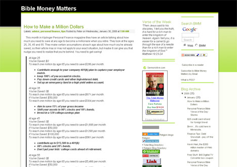
When i first launched the site in the beginning of 2008, I started the site as a Blogger blog. I didn’t even own my own domain name to start, although I ended up purchasing one a few months later.
The site used a free BlogSpot theme from one of the free theme websites, and it wasn’t exactly the prettiest site around. But it contained the colors I wanted – green and black – and it got the job done. It was functional, but it didn’t last very long.
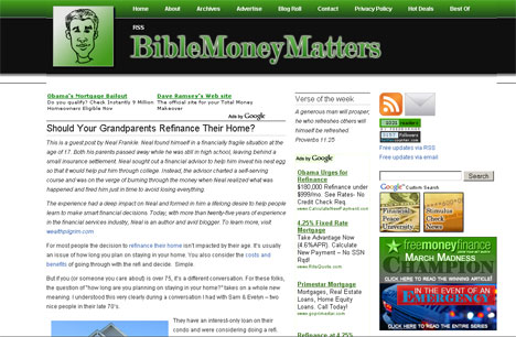
Five months into this blogging experiment I decided that I was going to stick with it for the long haul. I bought a new domain name and moved the site to a self hosted WordPress installation, moving it away from BlogSpot.com.
Once I had moved my site to WordPress I put up a new theme from Brian Gardner and StudioPress called “Vertigo”. Even at that time the theme was a year or two old, and again – it was a free theme. I customized it a bit with a logo design, and I was happy with that for a while.
I stuck with that design for almost a year, until I finally decided I wanted to use a theme that gave me more flexibility and options when it came to customizing my site.
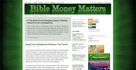
I put together and launched a customized version of the Thesis Theme for my site. In the end I stuck with that theme for almost 5 years. The site’s layout changed a bit over that time, but for the most part the design didn’t change – with the black and green starburst background and text header.
I was happy with the site’s design for many years, but a few things changed that made me realize the site was due for a redesign again.
First, DIY Themes came out with a new 2.0 version of the Thesis theme that just didn’t make sense to me. It is supposedly better in every way, but to me it just wasn’t as intuitive to use. It felt like a step back.
I also knew that I needed to update my site’s design to be mobile responsive as a larger number of my users were reading the site on their mobile devices.
Finally, I knew the site’s logo design was starting to feel a bit dated after having been live for over 5 years. It needed a refresh.
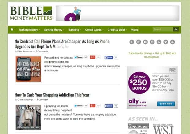
The New Design Using Genesis WordPress Framework
This past week I put the new Bible Money Matters design live on the site.
There were quite a few changes to the site. Among the biggest changes:
- A new logo design: I worked with friend and fellow Minnesota blogger Aaron of AaronDesign and Art For Your Blog on a new logo design. We went through a few iterations, but I’m very happy with the final result. Thanks Aaron!
- A new WordPress framework: The site’s framework has changed from Thesis, to the Genesis Framework from StudioPress. When I was researching WordPress frameworks to use on my redesign, time and again Genesis was touted as the cream of the crop. After using it for a short while I can see why.
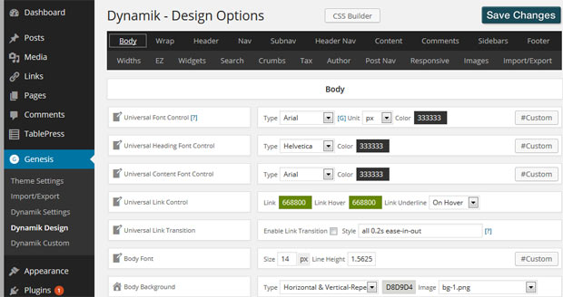
- A new child theme: In addition to investing in the Genesis framework, I also bought a custom child theme for the site called the Dynamik Website Builder for Genesis. Dynamik allows you to customize pretty much everything about your site from fonts and colors, to backgrounds, headers and custom homepage setups. Easy to use, and highly recommended.
- Mobile responsive: The site should now be responsive, so that no matter what device or size window you view the site in, it should adjust and be easily readable on your screen. I’m still working on a few things here, but for the most part the site should function on mobile devices now.
- Simplified sticky navigation: I had about 30 menu options up at the top of the page before. With the new design I’ve consolidated a lot of those options and simplified the navigation. It is also now a sticky navigation bar. We’re still iterating changes on the menu, but I’m pretty confident it’s a bit easier to navigate the site now.
Why I Bought The Genesis WordPress Framework With Dynamik Website Builder
After doing quite a bit of research on what Theme and framework to use for this site, I kept coming back to the Genesis WordPress Framework by StudioPress, and the Dynamike Website builder child theme. I knew a ton of bloggers that were using it, and that loved it.
Some of the reasons that I switched to using Genesis include:
- Easy to use: The Genesis framework is extremely easy to use with a whole host of site options, SEO settings and custom page frameworks built into the theme.
- Customizable: The theme is very customizable, through the stock configuration or through the use of child themes.
- Secure: The Genesis team brought on one of the core WordPress developers in order to make sure that the framework was as secure as possible. After having been hacked in the past and hearing other people have issues due to old outdated themes, it’s good to hear they’re serious about security.
- Tons of child themes: There are a ton of great child themes you can buy for the Genesis theme, many of them for anywhere from $20-30. I ended up buying the Dynamik Website Builder child theme (which costs a bit more) because of the sheer number of ways it allows you to customize your site.
- Large community and number of resources: There are a ton of resources available talking about how to customize Genesis, and in addition there is a large community of Genesis users willing and able to help you if you can’t find an answer.
- Easy updates: You can set the theme to email you whenever there is an update, and you can update your theme from the dashboard without worry of losing your customizations since they’re made to the child theme.
- Great reputation: Their reputation precedes them and you know they offer a quality product – that they’ll stand behind.
I may do a more in depth review of Genesis and Dynamik theme down the road, but for now let’s just say that I’m extremely happy with the framework and child theme, and that I look forward to using this theme for years to come.
Looking for a theme to use for your site? I highly recommend that you check them out:
- Genesis WordPress Framework
- Dynamik Website Builder (Genesis Child Theme)
New Site Giveaway
To celebrate the launch of the new site, I decided to do a giveaway!
To enter to win just check out the rafflecopter widget below and do the actions described to earn entries!
Prizes You Can Win
What are the prizes?
- Grand Prize: Big Bag of Personal Finance Books + $25 Amazon Gift Card
- Second Prize: $10 Amazon Gift Card



I like the updated theme – it’s seems sophisticated and modern! I really love that you stayed with the “green” colors however, I think it’s a good subliminal message when you are talking about money. I didn’t play around too much with the content but it seems easy enough to navigate around. My pet peeve is sites where you can’t find anything or it takes too many clicks to get anyway.
Thanks for letting us share our opinions!
Thanks for sharing your feedback Michelle. Any feedback I get is helpful, and I’m glad to hear you felt it was more sophisticated and modern!
Wow! You sure did go through a lot of research and work for this redesign. I’m impressed.
Thanks! Glad you were impressed. :)
I don’t like the website. Too many advertisements and too hard for me to figure out how to enter the contest. I couldn’t even post my comment correctly. Not all of us are computer savvy nor do we have the time to sift through all the information overload. I prefer it to be more of a simple informative website for me to learn some new ways to handle our money more wisely.
Sorry to hear you don’t like it. I understand that not everyone likes seeing the ads on the page, and I am actually exploring some ad alternatives as my current ad provider has a few issues. Thanks for your honesty, and I’m sorry you weren’t able to find the contest entry form at first. It appears you did figure it out though since your comment is now showing.
Hi Peter,
The new layout looks great in so many ways. The menu system is very responsive, the monetizing isn’t overbearing, and the color scheme looks great. Keep up the great job with providing us with good biblical financial advice.
God bless………..Doug
Glad you found the menu responsive, and the ads a little less intrusive. Still working on ways to balance the design and monetizing portion -it’s a balancing act!
Love the new design!
A fresh, clean, bright, more organized look and feel.
I look at other news sites for interesting reads, news, technology updates and finance as well now your site is right up there with some of my favorite sites which I like to share with my followers on FB.
Before I enjoyed the info but not the layout and feel so because of that I read your posts now & then but never referred anyone to the information.
Great Job!
Glad to hear you like the layout better now! Thanks for visiting and giving feedback.
I like the new format a lot! I usually read your blog on my kindle but the previous version of the site was a little less user friendly. What I did prefer on the previous site was the listing of articles that you had along the right side of the page. Overall, I enjoyed the previous version and I will most likely enjoy this one too.
I believe the same listing of articles is in the sidebar as before – not much has changed in the sidebar currently -although some of that may be changing soon as well. Any further feedback of what types of articles you liked seeing in that sidebar?
The new look is much cleaner and very nice. Great job!
Thanks for checking it out and giving feedback. A cleaner more organized feel was something I was aiming for in this redesign.
I like your new look. It is less crowded looking.
Good to hear that it looks a little less crowded. Thanks!
The new look is wonderful. It’s very easy to navigate.
Thanks for your feedback, that is one of the things I was shooting for! Hoping to continue to improve on that!
The new design is nice, but I am one of those people who don’t handle change very well. It is just something I will have to get use to. Keep up the good work, I enjoy your articles.
Terri, I’m one of those people too, I think that’s part of the reason why it took me over 5 years to give the site a new look. Hopefully it’ll grow on you and you’ll like it by the time we do our next redesign in 2019!:)
Thanks for sharing such great information! Generally always learn something of get a fresh perspective :) keep us the great work!
Thanks Ruby, I appreciate you taking the time to stop by and give some encouragement!
I love the new website look and feel! The information / content has always been great, but it’s so much easier to navigate! :o)
Glad you found it easier to navigate – I’m hoping to continue to improve on that!
The new look is great!
Thank you, I’m glad you like it. Our hope was to make it cleaner, easier to read and a bit more modern, and I think we achieved that to a good degree.
I like the new design. Thank you for the giveaway!
Glad you like it! Good luck in the giveaway!
It looks easy to navigate.
I’m glad you think so!
I like the new format. It is laid out well and easy to navigate.
Thanks Don! I’ll try to keep iterating and improving!
Love your site and your information! Thanks, and keep publishing on!
Thanks Stacy, I appreciate you taking the time to stop by and comment!
I like that the new site is more mobile friendly. The pulldown menus seem thorough and well organized. The ad on the top is bigger than your logo. The content is most important, though, as long as the ads don’t get in the way. I enjoy your posts.
Thanks Petra! I’m glad the more mobile friendly design is helpful. The ads are one of those things that it’s tough to find the perfect spot for them without overwhelming the content. Trying to find a balance there.
Love the new design and logo. Navigation is much improved, and the design is clean.
Thanks John! Glad you found it pleasing to the eye!
Love the new theme, Peter! In the past I’ve bought Thesis and recently I made the first $185 payment to my designer, but i haven’t been blown away by any of the designs. He’s using Woothemes which I’m still skeptical of, but it’s what he’s been using so I didn’t want to tell him to give something else a try.
A couple questions:
1 – Is the child theme you used easy enough for someone whose only experience with CSS and PHP is tweaking free themes a couple times in the past few years? I would much prefer to just find something simple that I can easily tweak and then move on.
2 – If i purchase the child theme can I use it on multiple sites? I’m launching a new one soon and I’d like to overhaul both the new one and the old one with the same theme.
The site looks great and would love to catchup sometime! I know organizing the MN fincon meetups takes a lot of work so if you don’t think we’ll have any sometime soon would be great to get together. We can take this ‘offline’ or ‘off-comment’ I should say haha.
Thanks David! We definitely have to do another meetup sometime soon..
I’m not real familiar with WooThemes other than having seen some of them before and thinking that they were pretty decent.
To answer your questions:
1. Yes, it’s easy to use for CSS and PHP novices. That’s essentially what I am and it has worked pretty well for me. It’s customizable enough that experts can dig into custom CSS and custom functions if they want, but also easy enough in that it has a plethora of menus where you can change fonts, graphics, layouts, homepage designs, etc. Genesis and Dynamik were easily some of the best money I spent for my blog in a long time.
2. Yes, you can use it on multiple sites. Their text: “How many websites can I build?: As many as you want. We want you to build as many personal, business and client sites as possible. Just remember that Dynamik Website Builder support is provided only to users who bought the license, so your clients will need to either get support from you or buy their own license and we have no problem with your customers buying their license for support using your Affiliate link.” Genesis has similar terms and can be used on multiple sites as well.
Looks easy to read. I like the Popular Posts where they’re easy to find.
Glad it’s easy to read. I increased the font size of titles and of the content to help improve readability on all devices.
Nice clean look. I like the way the page is centered.
Glad you like it Randy!
It’s funny how our site and hosting histories are almost the same!
The site looks great. Best of luck with it.
Thanks Glen! Yeah, I suppose our hosting histories have been very similar – up until your recent hosting switch. :) Thanks for checking out the site!
Your new look is very professional. It looks like many financial sites I have seen, but is also more customized to fit your needs. I think the only thing I don’t find appealing is the use of green everywhere. I know the experts say green means money and is somewhat calming, but your site is about more than interest rates and mortgage points. Perhaps, you might consider a different color such as blue?
Thanks Lisa, something I’ve considered – using a different background color and or other accent colors. Something I’ll definitely consider. thanks!
Been reading here for awhile now and love the look of the new theme. I’ve been really pleased with the Genesis framework for my site as well. I’ve done one site refresh since I started blogging 18 months ago and that was really fun. Sort of re-energizes you to see things change.
It’s been over 5 years for me since I did a site refresh, so I was definitely due! I’m liking Genesis so far as well, it’s been really easy to customize -along with the Dynamik child theme. You keep up the great work on your site too, been enjoying reading it!
I love this new look! Especially the logo.
the drop menus are great, the colors are nice. it looks clean cut to me :)
Thanks Cynthia! I’ll have to let the designer know you liked the new logo!
I like that it is easier to browse and find things, also like the neat and clean look
Thanks Belinda, I’m hoping to continue revising it to make it even more clear and easy to navigate.
I really like the look of the new site. It flows so well and the floating header is such a wonderful touch…no more scrolling up forever to get to the menu!
I have been wanting to redesign my site for over a year, but I don’t have to money to pay a developer or buy a new theme. We are still on Thesis 1.85!
Khaleef, up until I put the new design live I was on Thesis 1.84, so I was even further back than you! Putting up a new design can cost a bit, but to do my new design I think in the end it cost me about $400 after themes, child themes, design work and plugins – plus a bunch of my own time to put everything together. So, not super cheap, but also not as much as some people might assume. Thanks for the feedback!
I’m a newer reader Peter so can’t tell you much about how it compares to the previous version. There’s a lot of advertising on this site but looks sharp and very easy to navigate!
Thanks for telling me your thoughts so far Brian!
Awesome site! Thanks for the giveaway.
Thanks Thomas! I appreciate it!
The new design is very “clean” and easy to find information I am looking for, which is all I need!
I’m glad you found it to be clean and easy to navigate. Thanks for the feedback!
Congrats on your new site design. Well done.
Thanks David!
Nice work Peter! I like how clean it is and I like the sticky menu. I am working on cleaning up my navigation. I actually moved away from Genesis because it was too restrictive. I can code, so I didn’t like the framework. I do think it is good for many, but just not my cup of tea!
I think the combination of Genesis and Dynamik make it a bit more flexible as Dynamik has about a million and one options for things you can update, change or modify.. Plus it allows you to make changes to the code so as to affect things that way if you’re more advanced. For me that’s perfect. Sounds like you’ve got a skill set that I definitely do not – code is not my strong suit! :)
I really like this new look! Especially the logo. I like that it is simpler to surf and find factors, also like the elegant look. Thanks to provide this nice content. I really experienced to study this article.
Glad you like the new look!
I don’t know anything about websites except when I can’t move around to find what I need I avoid using that site/business. ATT is a perfect example of how not to do a website. I sometimes get stuck in their website for 10 minutes or so, just to find out one thing and then usually I cant find it.
I like the way your page is set up. Very straight forward. Nothing to distract you. It is very easy for me to see what if anything I want to read, do, maybe share with someone, or print out a very well written article.
Yours is the only webpage about money that I read every day. There is always something I can take away to help me manage my money and life.
Thank you for sharing for expertise. Jeri Atkin
Jeri, thanks so much for stopping by and checking out the new design. I’m glad you find the content useful – while the design is important – I do think the content is the most important thing!
I like the new look, easy to follow. I always like to look at your e-mails.
Thanks Fannie! Good to know that folks are reading the emails!
I like the new look Pete! Very clean and clutter-free, easy to navigate…great job!
Thanks Mike, I appreciate it!
Looks good M.O.G.. Man of God.
Thank you Ronnie!
This site is fantastic! it has helped me for years.
Thanks.
Catherine, I’m glad to know the site has helped you. That means a lot!
Love the new redesign! One suggestion, though. In order to post this comment, I had to scroll all the way down to the bottom of the page. I would like to see the comment post section at the top of all the comments instead of at the bottom.
Thanks for the suggestion! I heard that from at least one other person too, and I think it’s a good idea. I just made the change and the comment form should now appear above the comments.
I remember all those versions except for the 1st one! Very neat post :)
Thanks J! With as long as you’ve been at this, I gotta think you’ve been through one or two revisions by now too?
Love the redesign.
Thanks!
Your new site appears to flow better than your previous one and I am almost amazed how much free information you offer to your readers. Your suggestions got my family into a much less per month cell phone plan, actually, two: Republic and Ting Mobile.
Glad I was able to help – I’ve heard from several people who hadn’t heard of Ting and Republic who are now using them. I’d love to hear how they work out for you!
Enjoy your blog and its new design!
I’m glad you like it. Thanks!
I like all the changes/updates made! it makes accessing it easier and layout is clean and easy to navigate! Updating is always needed in everything and this new version is modern and eye catching
Great, I’m glad you like it! Glad you think it looks nice – and modern!
I love the new responsiveness on mobile devices. Thank you for all you do!
Good, I’m glad it works well for you on mobile. That was one of the main goals of the redesign!
I like the new look! The six categories with drop-downs are very easy to use and clean looking. I’m not crazy about the top ad being so big next to your logo. Nor do I like it in that logo banner area. It distracted me and for a moment I forgot where I was until I looked left.
Thanks for your website. It is a blessing.
Lori, thanks for the constructive feedback. I’m glad you like the new look, and I understand what you’re saying about the ad. In putting it where it is I was trying to do a combination of inserting it where a lot of sites put ads and many people expect it – versus putting it somewhere that it’s going to push the content down too far on the page. I am always considering ways to make the ads less intrusive while still allowing the site to make a little money for our efforts. thanks!
I do like your new layout. However, you really do need to lose the pop-ups – they are highly annoying and there is a tad too much advertising on your site. The content is great, but the ads are very distracting and I didn’t see where I could just email you a response in the body of the article.
Jim, when you refer to popups, are you talking about an infolinks ad on the page that seems to popup sometimes? if so, I understand your frustration, and have mentioned not wanting that particular ad with my ad network. Seems to keep sneaking back in though.. Thanks for the constructive criticism.
I love that you always take the time to obtain the pulse of the readers! I always like the content on the pages and had no qualms with the previous site layout (probably because I’ve only been reading for 1.5 years). With all of that out of the way I’d like to comment on the layout as a smart phone reader (I’m at grad student):
1. I like the drop-down menu at the top of page, which allows me to access different themes
2. I like that the formatting of the paragraphs and bullets seem to be consistent with the desktop website
3. I’m prefer a less monochromatic color scheme; I think it would take away from readers that are reading for the first time. Color seem to attract attention. In its current state it seems a bit mundane, but it may just be my preference.
4. I wish there was a way to avoid scrolling through the comments if your are not interested in the event you are more interested in a related post (perhaps a drop down).
5. Thank you for all your posts that reflect your passion coupled with wisdom!
Danielle, thanks so much for taking the time to write out your well thought out feedback. It definitely gives me a lot to think about in regards to color/schemes/etc. Thanks!
I really like the new design, seems easier, more professional and organized. Thanks for the information. Seems speedy enough too, I think that is important.
Thanks Sharon! Glad you found it more professional feeling – and that it loaded relatively quickly.
Love the new logo and sticky nav bar.
I’m glad you like the new look and navigation. Still working on finalizing the navigation, but hopefully you’ll like the final product!
New reader, found you through youngadultmoney.com. I really like the cleanliness of the logo/header and the amount of white space on the new design. Very eye appealing!
I’ll have to say thanks to David over at Young Adult Money – he’s a fellow Minnesotan! Glad you like the new look, thanks for stopping by!
The new layout is very nice and easy to navigate.
Thanks Jason!
I like the sticky navigation bar, it makes it so much easier to move around a blog
What I like best about the new design is how user-friendly and straightforward it is! It’s very easy to navigate.
I like the new design. Please keep publishing, Peter. It is my practice to read your e-mail. I can see you put in considerable effort for the new look.
Blessings to you,
Alan
I think your new website looks great! I’m currently in the process of a new site design as well :)
the green background is great looking …it seems you have done a lot of work to make this …its really impressive..
Love the new design. Regardless, the advice you provide is always a great design.
I love the modern theme!
Love the new site. It’s crisp and clean and smart. Personally, I like a challenge and love to figure things out. I like the satisfaction that I get realizing that once I figure it out, then it wasn’t as difficult as I thought. Just like your new site. Not to mention the invaluable information that you provide and most often it’s something that I haven’t read or heard of before or a new spin on something. You do your homework as well and don’t just write something that you’ve heard. You always research it to make sure that it’s accurate and true. Thank you
Really like the new design Peter! It came up nicely on my phone. And I appreciate that you took the time to give the details about how you chose the infrastructure. Your teacher’s heart is apparent.